Summary analysis
Quickly summarize and compare raw or noramlized data across groups, however you choose to define them, for concise overview of your experimental results, enabling easy interpretation and decision-making.
Pluto's Summary Analysis simplifies data exploration, allowing researchers to swiftly summarize and compare datasets. This feature is crucial for initial data investigation, helping to identify trends, outliers, and group differences without deep statistical knowledge. It's designed to accelerate the hypothesis-testing process, ensuring that biologists can focus on discovery and interpretation.
Example
What can I do with this analysis?
- Comparison across groups: You can summarize raw values for one or more targets across different experimental groups or conditions.
- Pattern identification: By examining the summary statistics generated by the analysis, you can identify trends and patterns in your data.
Suggested applications
- Treatment response analysis: Use summary analysis to summarize raw values of biomarker expression levels before and after treatment, enabling you to assess treatment response and efficacy.
- Disease progression monitoring: Use summary analysis to track changes in raw values of disease biomarkers across different disease stages or time points, facilitating monitoring of disease progression.
- Experimental condition comparison: Use summary analysis to compare raw values of targets across different experimental conditions, helping you understand the impact of various factors on your study outcomes.
Plot types & customizations
-
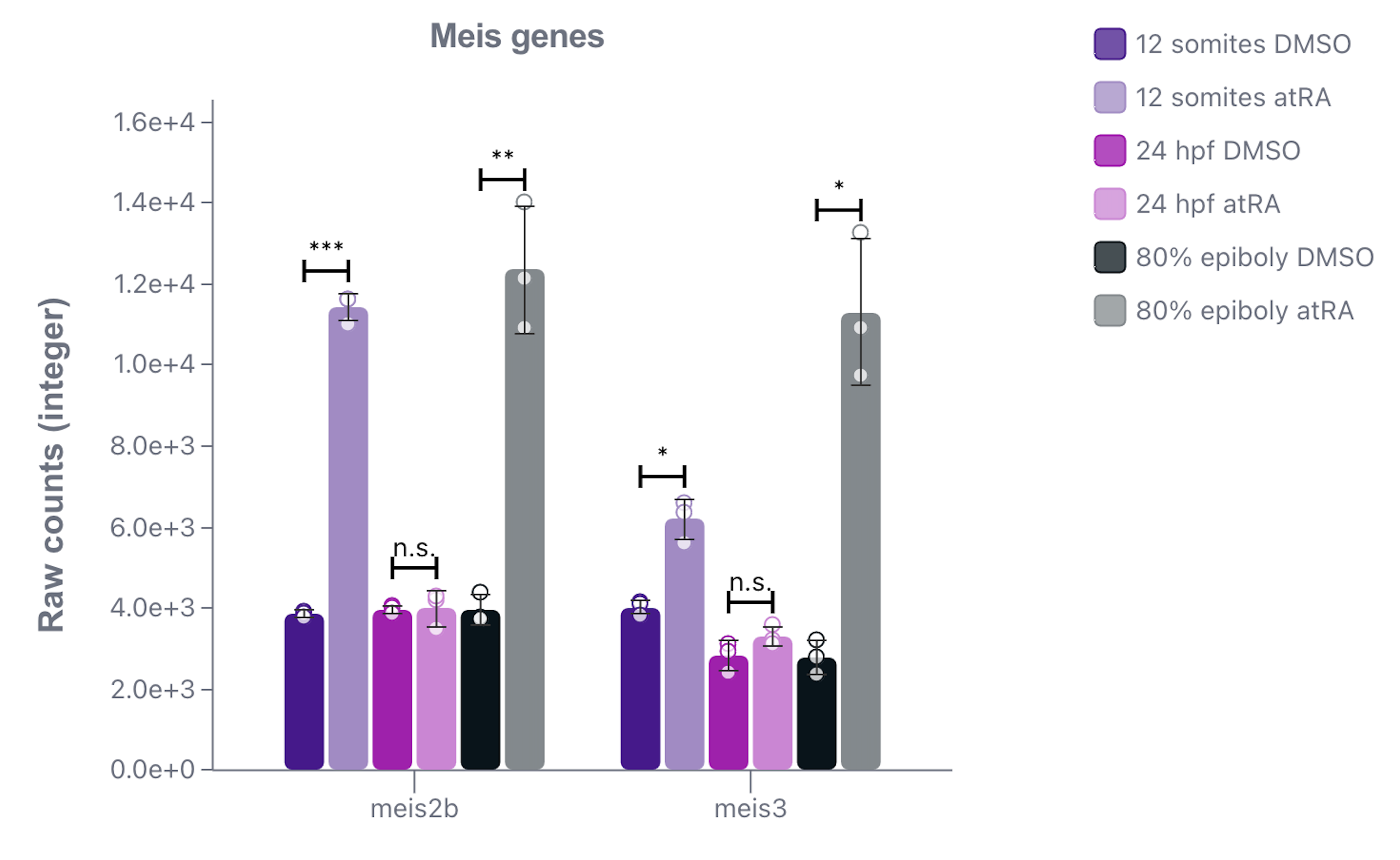
Bar plot: Visualize target gene expression values (raw) across the groups you're comparing, and run statistical tests between groups of interest. You'll be able to customize properties such as:
- y-axis scale
- Error bars
- Group colors

-
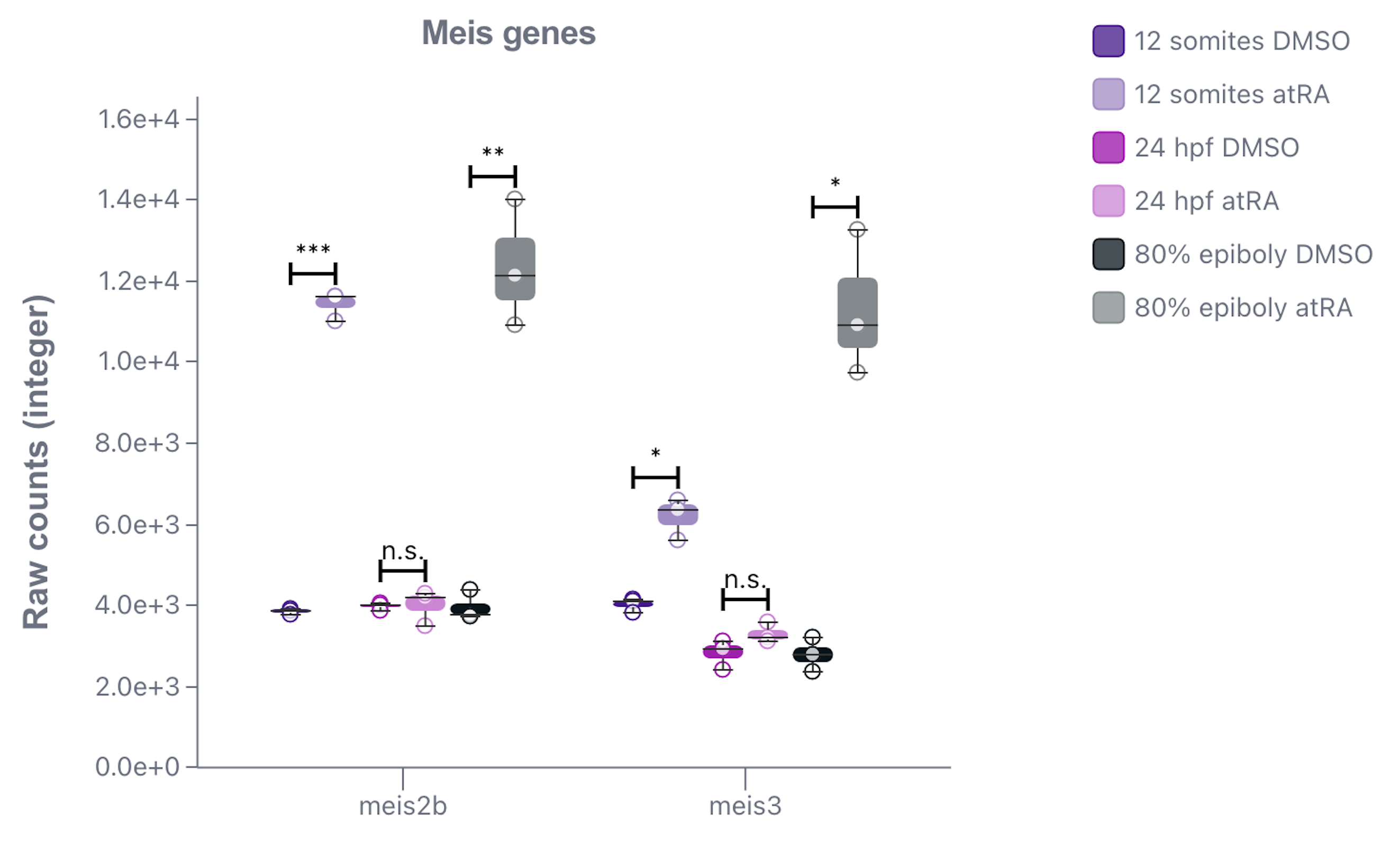
Box plot: Compared to bar plots, box plots provide a more detailed view of the distribution of target gene expression values (raw) across the groups you're comparing. You can run statistical tests between groups of interest, and customize properties such as:
- y-axis scale
- Group colors
-
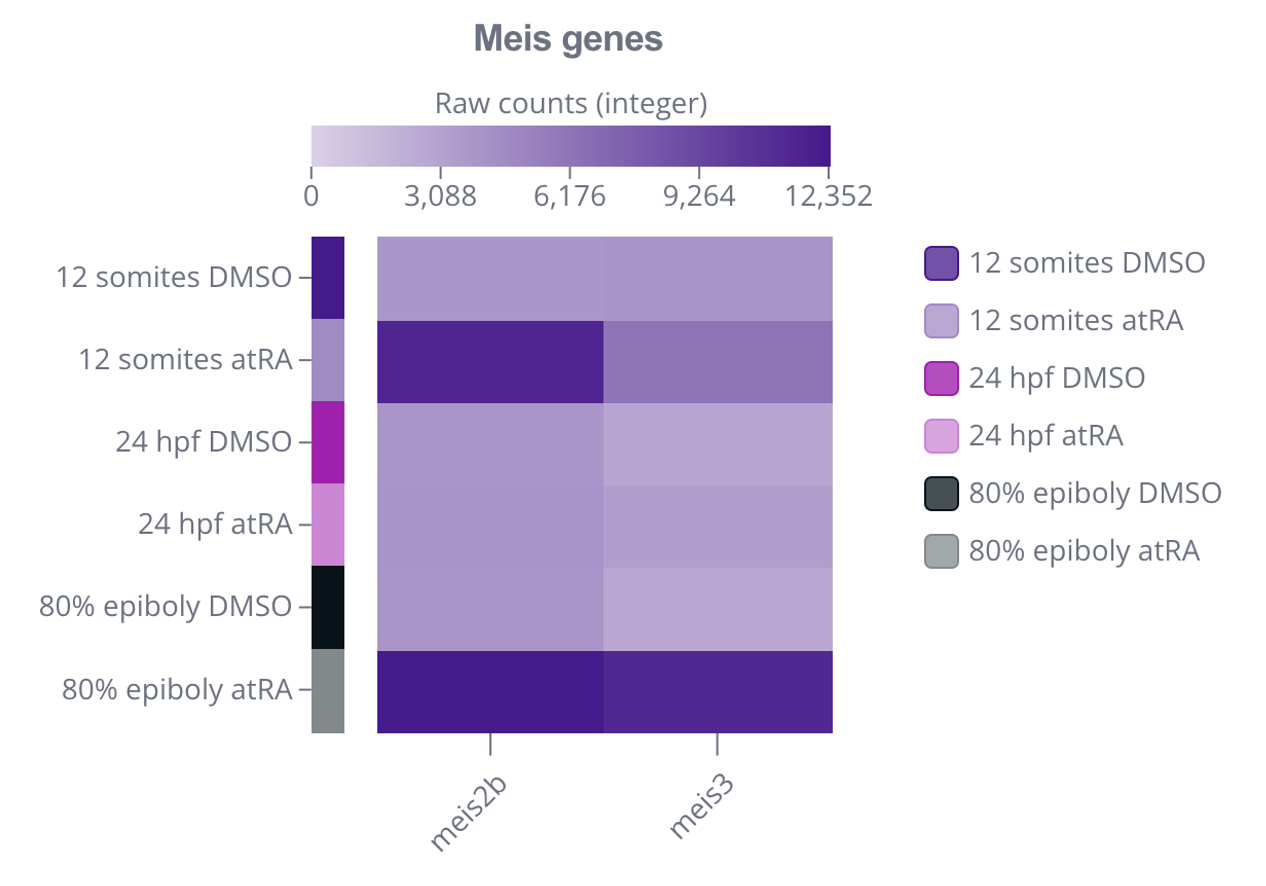
Heatmap: Visualize either the average or median target gene expression values (raw) in the groups you're comparing with a heatmap, or visualize target gene expression values (raw) on a sample-level. You'll be able to customize properties such as:
- Heatmap color theme
- Group colors


Additional resources
Ready to accelerate
your research?
See how Pluto can transform your multi-omics workflow.
Book a personalized demo