Pathway analyses
Explore the molecular pathways driving biological functions and diseases. Use powerful pathway analysis tools including GSEA, TFEA, ORA, and STRING to facilitate the discovery of critical interactions and regulatory networks.
Pathway Analysis on Pluto Bio leverages comprehensive tools like GSEA, TFEA, ORA, and STRING, enabling researchers to dissect the molecular mechanisms of diseases and biological functions. This analysis fosters an intuitive understanding of complex interactions and networks, bridging the gap between raw data and actionable biological insights. Pluto Bio's seamless integration of these tools democratizes advanced bioinformatics, making it accessible to biologists without specialized computational training.
Example

What can I do with this analysis?
- Functional annotation of genomic regions: You'll be able to annotate your peak regions, categorizing them as promoters, enhancers, or other regulatory elements.
Suggested applications
- Disease association: Annotate peak regions between healthy and disease samples to classify regulatory elements associated with disease states.
- Regulatory element identification: Use functional annotation analysis to categorize consensus peak regions identified across multiple cell lines.
- Molecular basis of disease: Annotate differentially bound/accessible regions identified between two groups, such as treated and untreated samples, to characterize regulatory elements associated with specific experimental conditions.
Plot types & customizations
-
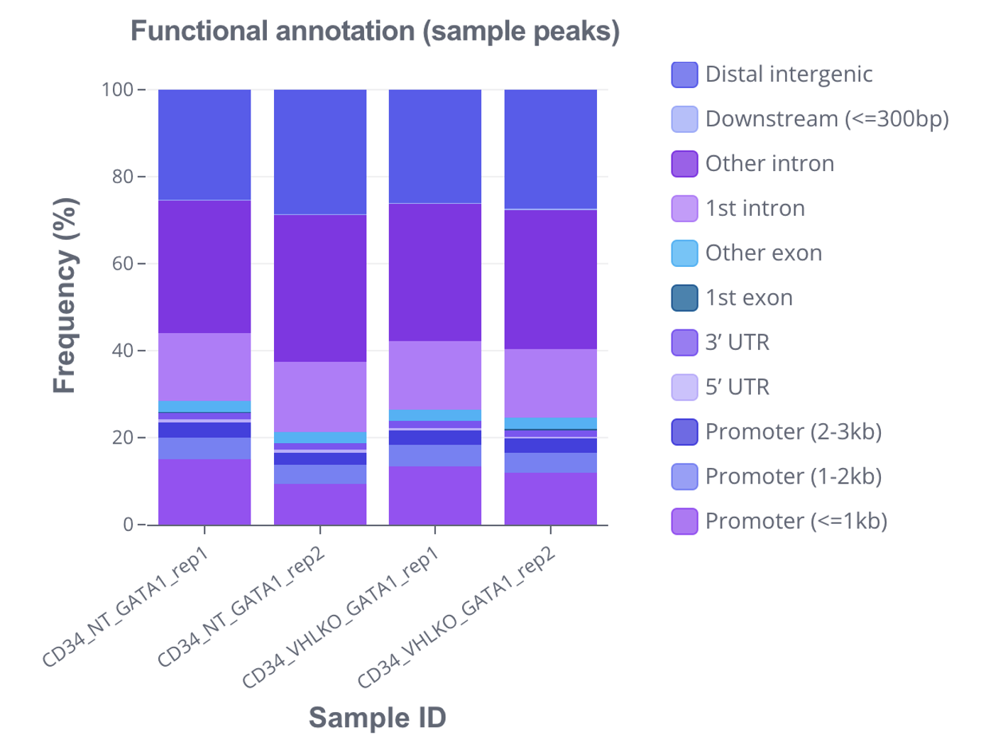
Stacked bar plot: A special kind of bar plot, stacked bar plots show functional annotations attributed to each peak set. Each bar represents a peak set, and segments within the bar represent frequencies of different annotations. You'll be able to customize properties such as:
- Transposing the x- and y-axis
- Annotation colors

-
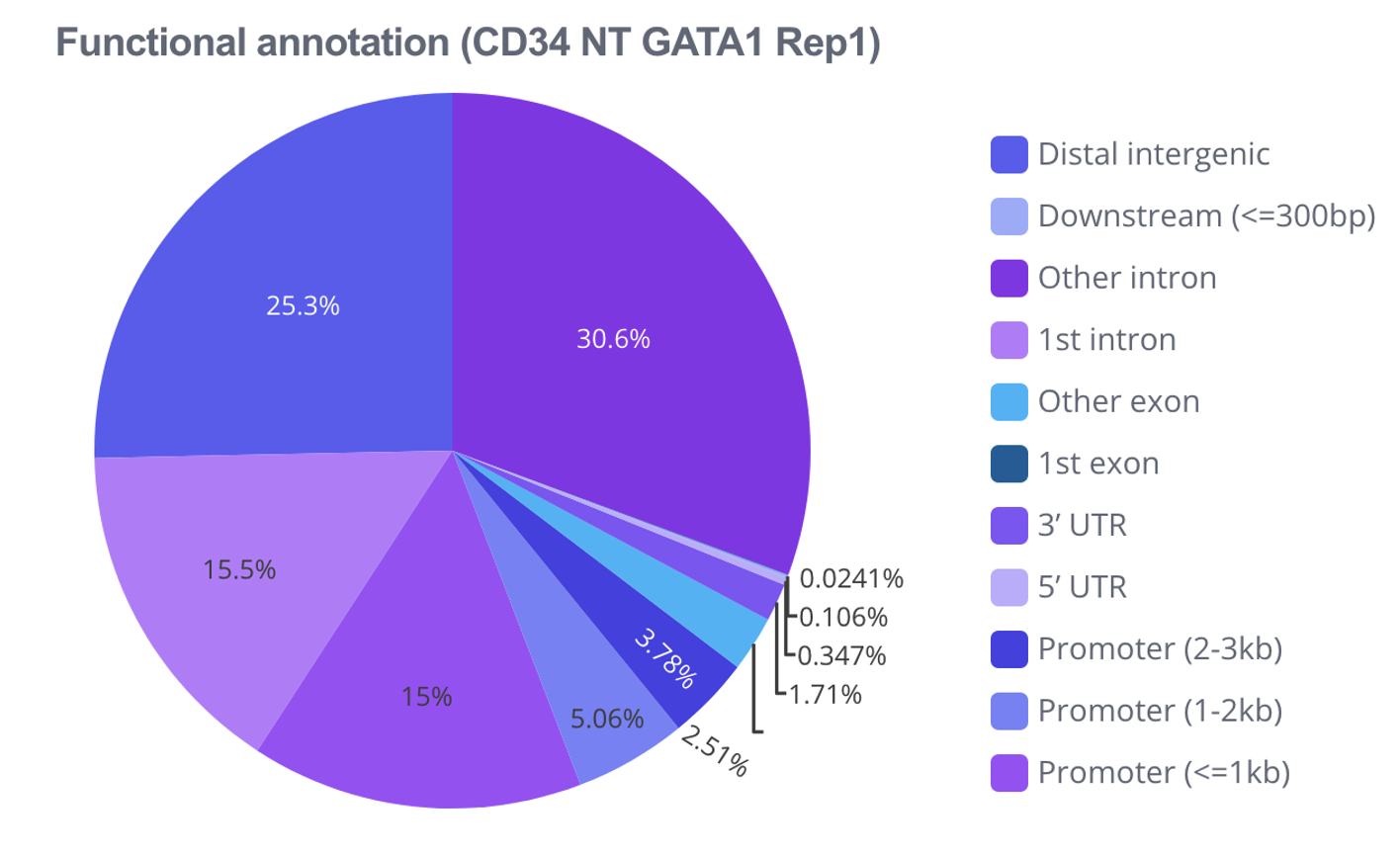
Pie chart: Visualize an individual peak set using a pie chart, where each slice represents a distinct annotation and its size corresponds to the annotation's frequency. You'll be able to customize properties such as:
- Selecting a peak set to visualize
- Showing percentages on the chart
- Annotation colors

Additional resources
Ready to accelerate
your research?
See how Pluto can transform your multi-omics workflow.
Book a personalized demo
